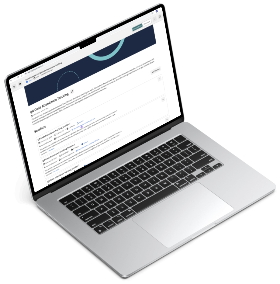
Attendance Tracking Made Easy
Summary
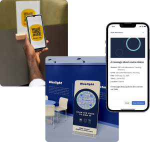
Highspot is a sales enablement and content management platform. It includes a Training and Coaching (“T&C”) branch that is used to strengthen client sales teams and keep their training initiatives organized. Tracking course and seminar attendance ensures that sales teams receive proper training. However, the process had some challenges: attendees could not register, and tracking attendance in bulk (e.g., seminars and webinars) was too labor-intensive for instructors. Implementing QR codes for logging attendance addressed these problems, reducing the workload for both instructors and attendees, adding convenience, and providing a scalable solution as companies grow.
Responsibilities
Design Lead; responsible for all Product/UX Design-related tasks
Duration
8 weeks; Agile release schedule
Platforms
Desktop web app, native mobile app
Deliverables
- Competitive Research
- Developer Hand-Off Documentation
- High-Fidelity Mockups
- Low-Fidelity Sketches
- Personas
- Product Specifications
- User Journey Map
Tools
- Figma
- Google Docs
- Google Slides
- Jira
- Slack
The Why: Growth and Scalability
● Training and Coaching features contributed to a 25% increase in sales during 2023, proving to be an area for continued investment.
● By utilizing QR Code attendance tracking, we could significantly improve attendance management for large sessions, drive usage of the mobile app, and strengthen Training and Coaching capability.
● Tracking attendance in bulk (500+) offers a practical solution for large companies and allows the product to scale alongside smaller companies as they grow.
NOTE: the decision to design a QR Code experience was made based on findings from the UX Research Team
My Strategy for Fast-Paced Design
Due to Highspot’s fast-paced startup environment, it was common and expected for our design team to work directly in high-fidelity, building off existing UI patterns and utilizing our robust, evolving design system. To minimize re-work and keep the project on schedule, I used design tools and methodologies that felt like they would yield the most value in this instance.
Discovery: Specs, Users, and Competitors
Work on this project began by performing several discovery-related tasks to better understand the project’s needs, technical capability, its users, its competitors, and context.
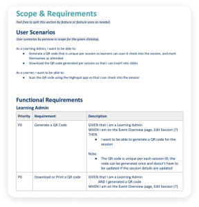
Functional requirements and user scenarios refined with Product Management and Engineering to clarify needs and ensure feasibility
Product Specifications outline the essential details and requirements of a product to guide its design, development, and production. For this project, Product Management initiated the spec, and through discussions between them, myself, and the Lead Developer, the spec was refined to include critical design and engineering details. This helped us gain significant clarity on the assignment, specific needs to be met, and technical feasibility.
'Learning Admin' and 'Learner' personas created through insights, ensuring a user-centric focus
The two main users of this experience are Learning Admins and Learners. To better understand them, I extracted information from the UX Research Team, Project Management, the Design Team, and my own intuition as someone required to attend countless work-releated training courses in the past. Creating personas allowed me to organize thoughts and ideas about the users and ensure that they weren’t forgotten during the design.
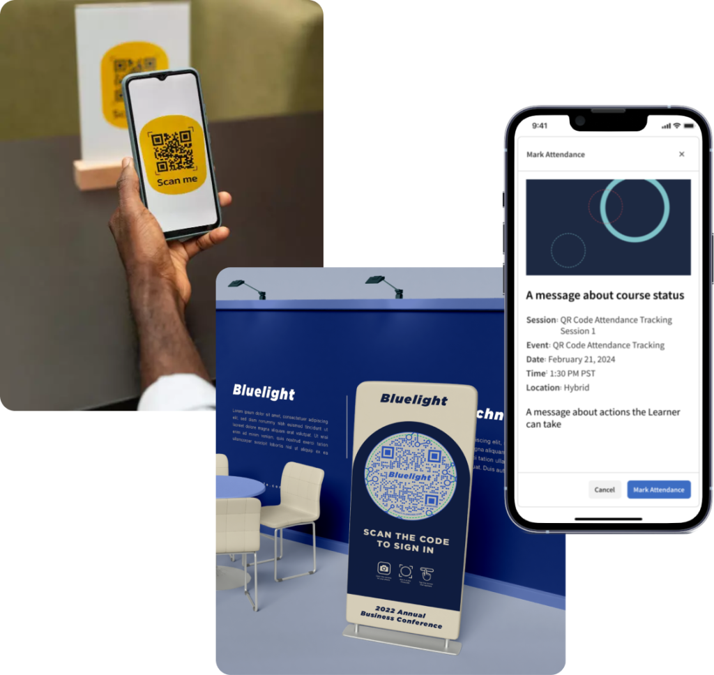
Competitive differentiation accomplished through app-based authentication, minimizing errors
Studying how similar products utilize QR codes helped us to differentiate our product. Using QR codes to mark attendance is not a new feature within the industry. Unlike others, however, Highspotʼs design required authentication via its mobile app, reducing the risk for errors and allowing for the convenience of single-button attendance confirmation. It also allowed Learners to show up to events without needing to register, unlike other products that required pre-registered tickets.
Common design and usage patterns utilized for easy, intuitive use, encouraging adoption
• Uses a smartphoneʼs native scanner app
• Single QR code usage for a specific session
• Single tap confirmation
For ease of use and to encourage adoption, the design utilized patterns that are intuitive for the featureʼs intended audience:
Ideate, Design, Iterate
With a better understanding of the experience’s needs, its users, technical capability, and distinguishing features, ideas about the design could be formed, the user journey (flow) could be mapped out, and the mockups could be created and iterated on.
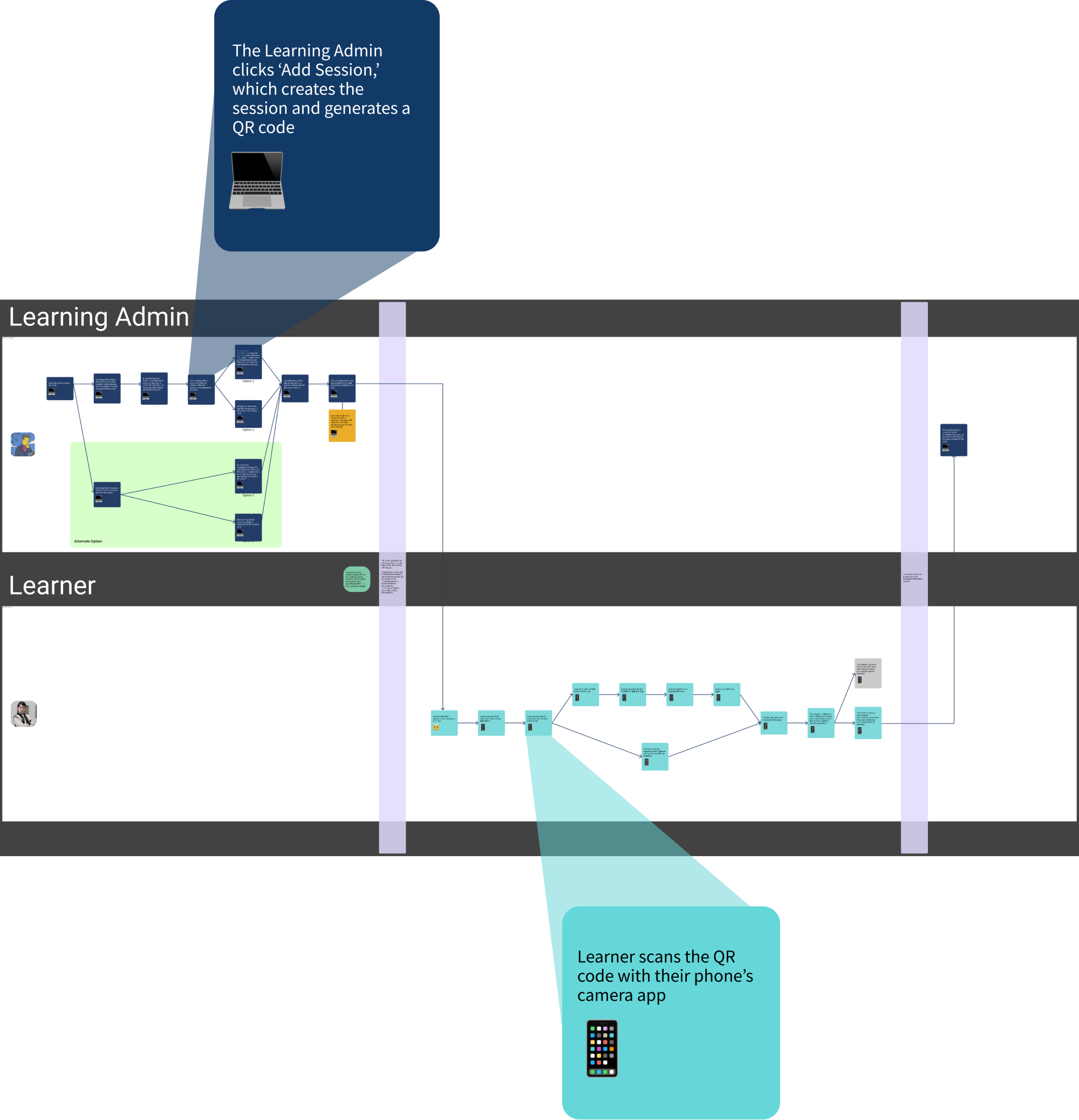
User journey mapped to visualize and align the entire experience across multiple devices and personas
When creating the user journeys, studying the Highspot app’s functionality, understanding typical mobile patterns, and being aware of common QR code usages was necessary to optimize the entire user experience. It was helpful to note that Learning Admins would use both the desktop web application and the mobile app, but Learners would use primarily the mobile app. To develop and understand the entire combined user journey, I created a journey map that encompassed both personas and all devices.
High-fidelity mockups efficiently generated, allowing for thorough design communication
Frequent feedback and open collaboration ensured technical feasibility and optimized design
Because of the limited timeframe, having frequent feedback sessions and reviews with the internal Design Team and Project Collaborators (Project Management and an Engineering Team) was essential to successful execution.
• The Design Activation Team, which T&C is a part of, held weekly huddles for on-going design reviews and feedback. I took full advantage of this time to review my work with my peers and management. I received valuable feedback on every part of the experience: usability, UI design, and intuitiveness.
• The Project Team consisted of a Designer (myself), a Project Manager, and Engineers (a lead developer and their team). Our discussions were vital in understanding the full intent of the feature and what was technically capable.
The Finished Experience
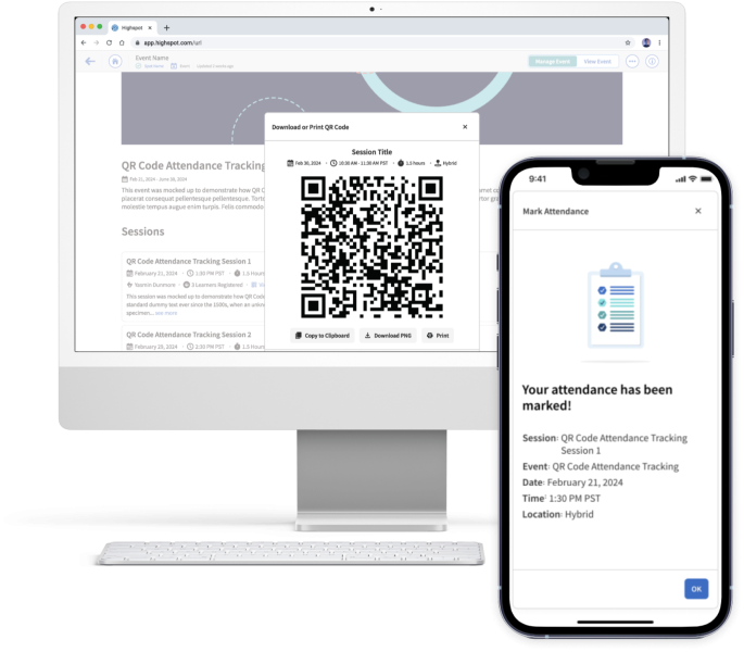
After implementing all the feedback, creating each screen in high-fidelity, and gaining approval from leadership, stakeholders, and collaborators, the design was considered to be complete. The basic steps are as follows, and the design consists of three parts, each with their own sub-steps. Two personas are involved in these steps:
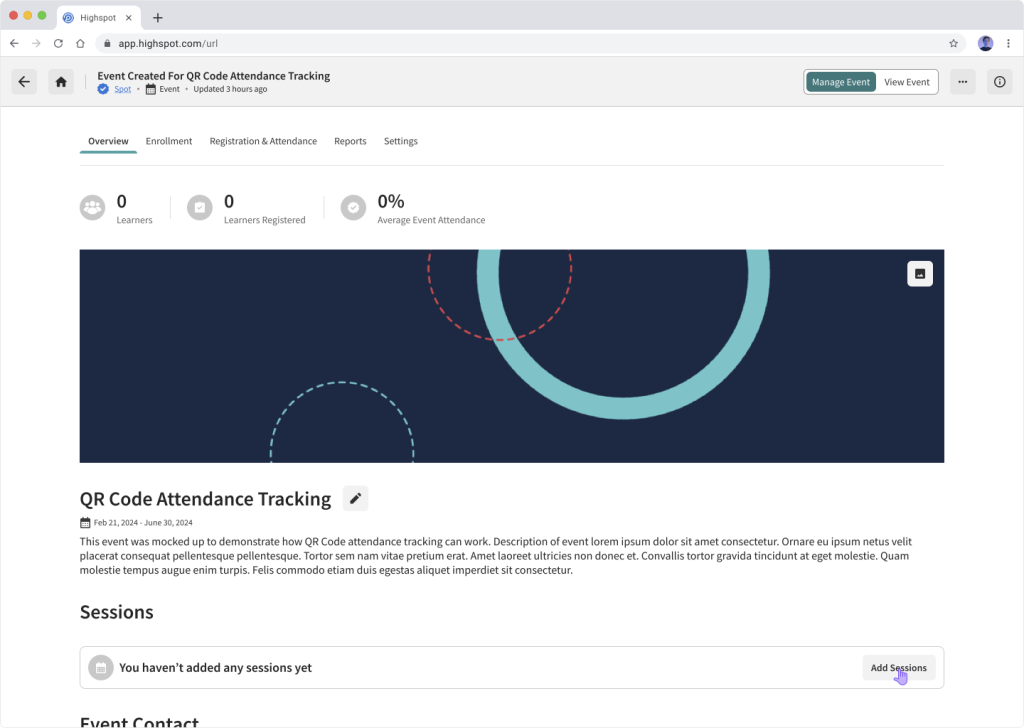
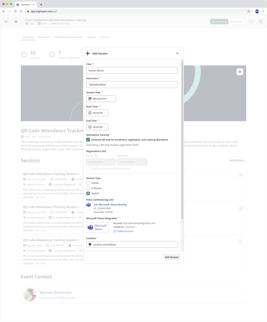
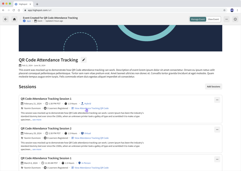
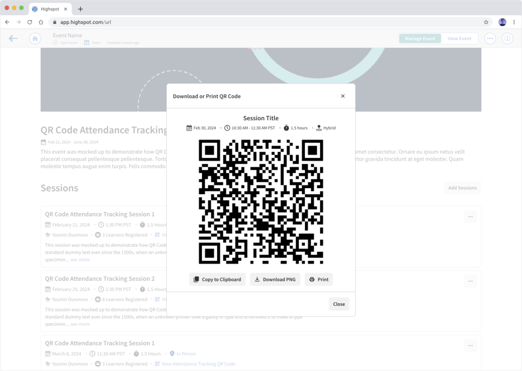
- The Learning Admin, responsible for setting up courses, sessions, and seminars within Highspot, uses the desktop web app to create a QR Code that can be used for attendance tracking.
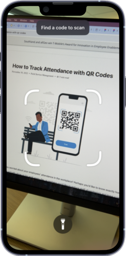
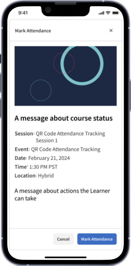
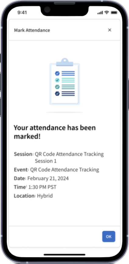
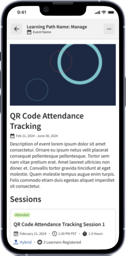
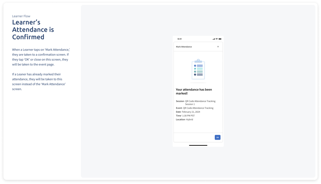
- The Learner, attending courses, sessions, and seminars, uses the Highspot mobile app and their phone’s QR Code scanner to log their attendance.
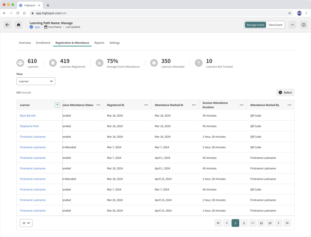
- After the Learner logs their attendance, the Learning Admin can verify attendance by checking attendance data on the desktop web app.
NOTE: Only major screens are shown below for succinctness
1. The Learning Admin sets up the QR Code
2. The Learner scans the QR Code to mark their attendance
3. The Learning Admin verifies attendance
Developer Hand-Off Documentation
With the screens created and the design approved, the final step (pre-deployment) was to provide Engineering with the documentation required to build the feature. Engineering required that Design supplied a templated sheet to them that detailed each step of the experience. Each sheet consisted of a high-fidelity mock of each screen, an explanation of the screen’s purpose, notable interactions, and any specific experience-related functionality. With this information, Engineering could code the experience, readying it for release.
Outcomes and Next Steps
Conclusion
Questions to Ask
To measure and improve performance of the design post-release, some of the questions I would ask include:
- What percentage of sessions have generated QR Codes?
- What is the adoption rate of the feature, as seen through app downloads and QR Codes generated over time?
- Are users getting stuck anywhere in the process?
- Has customer support been required for assistance?
- Has anyone stated how they feel about the feature?
- Are there steps that can be eliminated?
- Either through design or engineering
If I Had More Time
If I had more time to work on this project, I would:
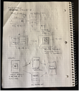
- Spend more time hand sketching. Fortunately, working mostly in high-fidelity was possible, but I would have enjoyed being able to spend more time in this phase of the creative process.
- Fully prototype the experience in Figma. Although this was not necessary due to Highspot’s already-established interaction design guidelines, it may have helped when sharing my ideas.
- Find all edge cases, determine how to address them, and create the associated designs and documentation. Some of the common edge cases were addressed, but there may have been some that were left undiscovered. Finding these cases and designing for them would have increased the experience’s robustness.
What I Learned
Through this project, I was able to gain further experience on how to lead the design of a feature in a fast-paced startup environment. Some of the lessons that were learned or reiterated through it include:
- Get feedback early and often. Being able to review my work with my peers was crucial to developing a quality design and minimizing re-work.
- Understand technical capabilities. Establishing a healthy relationship with engineering and checking in with them regularly ensured that the design was something that could be coded.
- Be flexible and able to accept feedback. Throughout this project, a few required features were added on from the initial spec, adding to its complexity and changing how certain parts were executed. Being able to work with the added requirements ensured an optimal outcome. Receiving feedback was critical to ensuring both an optimal User Experience and UI Design.
- Don’t be afraid to ask questions. There was a time in my life when I was hesitant to ask questions out of fear of looking stupid, but now I’ve come to realize that I would much rather have the clarity and knowledge that comes from asking them, worrying less about how I appeared.
Additional Info
For more information on the project, check out the slide deck below that was prepared for internal presentations:
