What is Lifelink?

Lifelink’s briefing read: “design an app that teaches people first aid.” The project involved designing for mobile, tablet, and desktop formats. I found this topic to be interesting because a wide range of the population is likely to encounter a situation where having first aid knowledge would be useful. Read on to find out more.

When You Need to Know What to Do...

THE GOAL:

• The goal of this project was to create mobile, tablet, and desktop versions of an app that could teach people first aid. This is a product that the general population could benefit from, so having a highly specified audience didn’t make sense. At the time of this project’s creation, however, the audience was limited to those that are English-speaking, and living in the United States.

ROLES:

• Research, results analysis, persona development, journey mapping, concept ideation, concept testing, wireframing, visual design, prototyping, user interface design

CONSTRAINTS:

• This was an independent project, so it wasn’t easy to bounce ideas off other people or split up tasks such as research, competitive analysis, usability testing, etc.

Research Methodology

– 8 Interviews performed
– Age Range: 25-63
– Non-specific gender
– Various family situations
– Various professions
– Various lifestyles
– Semi-structured, centered around first aid knowledge, goals, pain points, what they would like to learn, and useful features
– Partially remote, partially in person

Persona Development

Based on the research conducted, the following personas were generated to highlight how the app would be useful to a wide range of people in different settings.

Ideation

Using the “Crazy 8’s” Technique to Generate Ideas

After performing user research and a competitor analysis, it was found that CPR was one of the most common procedures associated with first aid, followed by drug overdoses. Most users thought that a mobile application would be most useful to them in an emergency situation, but a desktop application could be useful for education in non-emergency situations. Based on this, it made sense to first ideate for a mobile application that was lightweight and easy to follow.

The ideation process also resulted in another feature: the ability to alert emergency medical personnel of an incident and its location from within the app.

Lifelink - Iteration #1

Usability Testing

Through usability testing, several insights were able to be gathered. The idea was well-received and the audience it was tested with felt that ‘everyone should have this,’ as emergency medical situations don’t discriminate. They also found the emergency alerting feature to be useful for saving time in emergencies. An area that was found to need adjustment was in how the instructions were delivered: users stated that having to move between pages could be cumbersome in an emergency and that it would be easier if all the instructions were on one page. They also stated that illustrations (not yet ready during testing) would be helpful in understanding how to provide first aid. These insights were acted on to refine Lifelink.

Affinity Diagram Generated From Testing

(note that each post-it note says “Alfonso Tan” because I logged each item; testing was done across different people)

Lifelink - High Fidelity

Tablet and Desktop Formatting

As mentioned, this project also involved creating tablet and desktop versions of the mobile app/website so that Lifelink was available on the most popular platforms. All functionality was translated over, but the desktop format has a more informational tone in comparison to the mobile version.

Prototyping

Through feedback gained from usability testing, the complexity of Lifelink was significantly reduced. The user flow for administering CPR is shown above for mobile, tablet, and desktop formats.

Conclusion

IMPACT

Lifelink was well-received by everyone that interacted with it. They thought it was a great idea and might be a a worthy requirement for traveling on cruise ships, going to music festivals, and other places where first-aid may be more likely.

WHAT I LEARNED

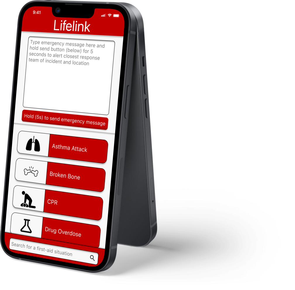
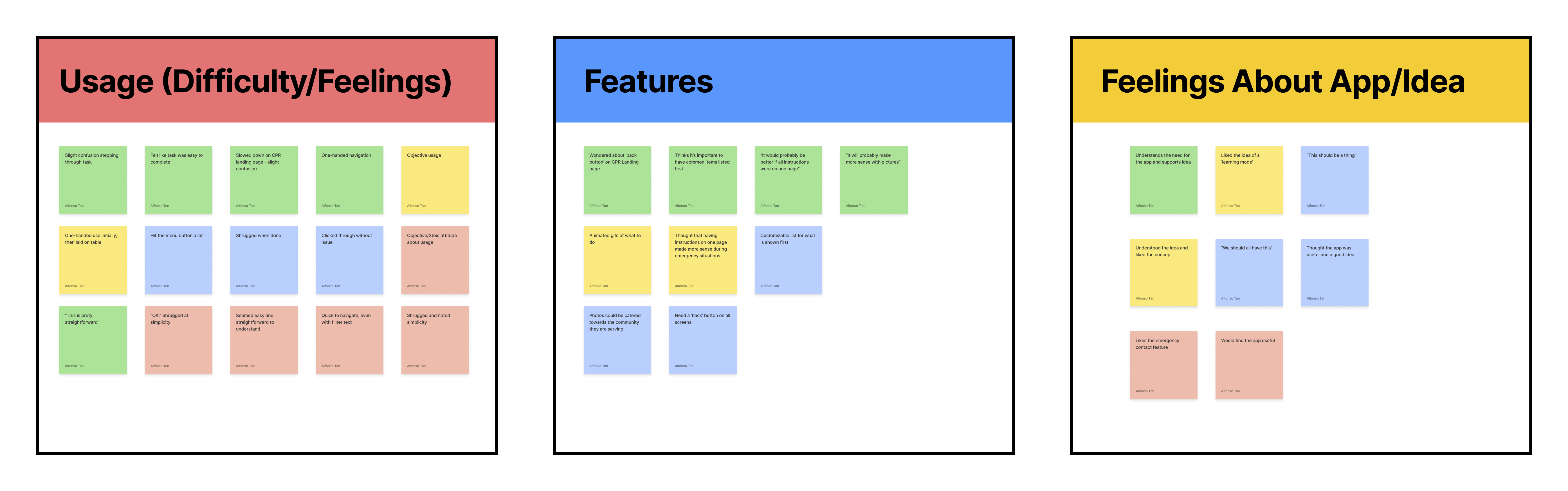
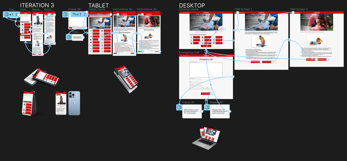
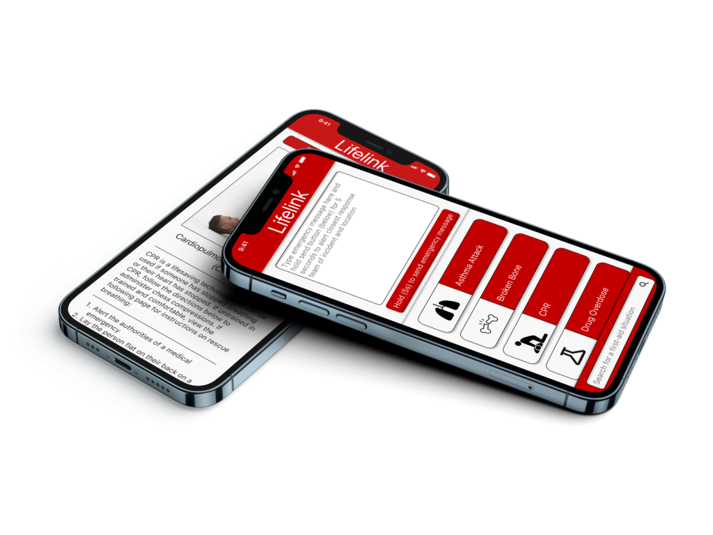
I learned of the importance of simplicity. Initially, I was worried about ‘screen count,’ but the best solution involved keeping the data together on one screen (in other cases, it might mean separating it out, but user feedback revealed otherwise in this case)