Driving music venue growth and increased loyalty through perks and rewards
For Venues & Music Lovers
Summary
UpBeat is a mobile app that serves as a music venue loyalty program. Its intent is to drive venue growth and increase patron loyalty. As a lover of music and a frequenter of music venues, I was excited to take this on and learn what I could from it!
*NOTE/UPDATE, 12/2022: This project was originally completed in May of 2022, and I’ve learned a lot since then. Out of curiosity and interest, I decided to take what I’ve learned and give UpBeat an refresh. The results can be seen at the bottom of this page: jump to update
Constraints
This was an independent project, so it wasn’t easy to bounce ideas off other people or split up tasks. Also, there was flexibility with deadlines, but being able to invest a consistent amount of time into the project was challenging due to other competing demands.
Roles
UX Design Lead; responsible for all research and design.
Duration
12 weeks
Platforms
Native mobile app
Deliverables
Affinity Diagrams
High Fidelity Mockups
Personas
Prototype
Storyboard
Wireframes
Tools
Figma
FigJam
Google Docs
Google Sheets
Google Slides
Understanding the Audience
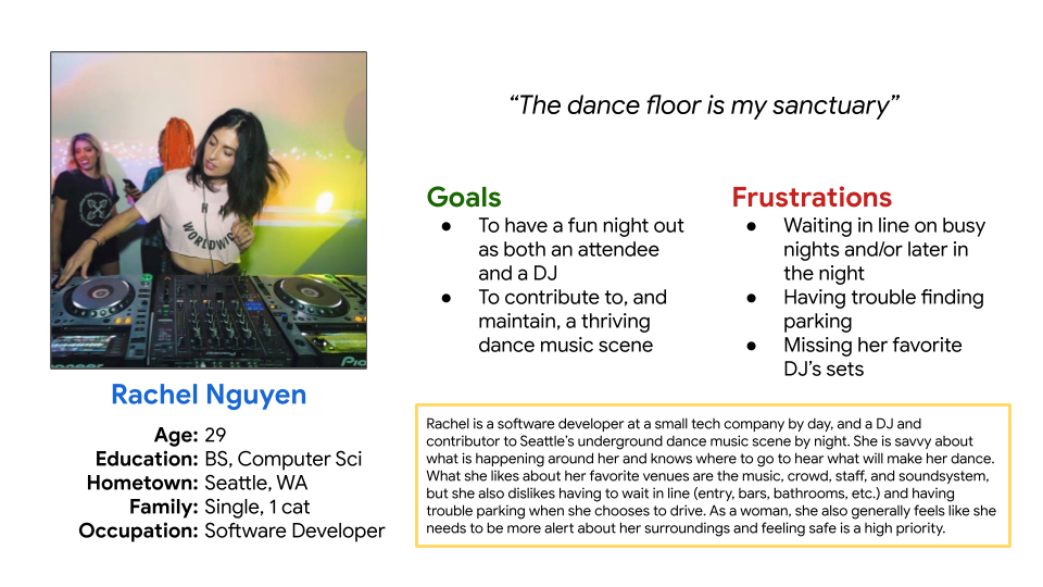
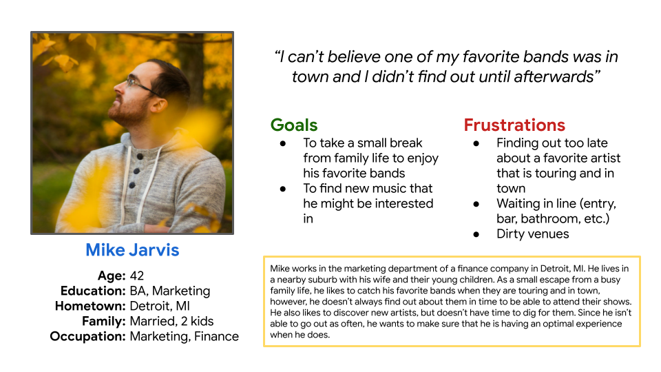
To gain better definition about the problem to be solved and to understand the audience, user research was conducted and personas were developed. A variety of people who frequented music venues were interviewed to gain undersanding. One of the main findings was that users disliked having to wait in line to get into their favorite music venue.
Diverse perspectives uncovered music venue experiences, preferences, and pain points
• 8 Interviews performed • Age Range: 28-63 • Non-specific gender • Various family situations • Various professions • All interviewees must attend – or have an interest in attending – music venues for concerts, shows, dance events, etc. • Semi-structured, centered around music venue experiences, venue likes/dislikes, goals, pain points, and what interviewees would find helpful • Partially remote, partially in person
Commonalities between younger electronic music club-goers and more mature rock fans were discovered: convenience and awareness
Through user research, it was found that music venue patrons lead diverse lives. Some of them are heavily involved in the music scene, while others are happy to have a night out from family life to catch their favorite band. Despite this contrast in personality, it was found that music venue archetypes want an experience with minimal inconvenience and they want to stay informed.
Ideation, Testing, & Iteration
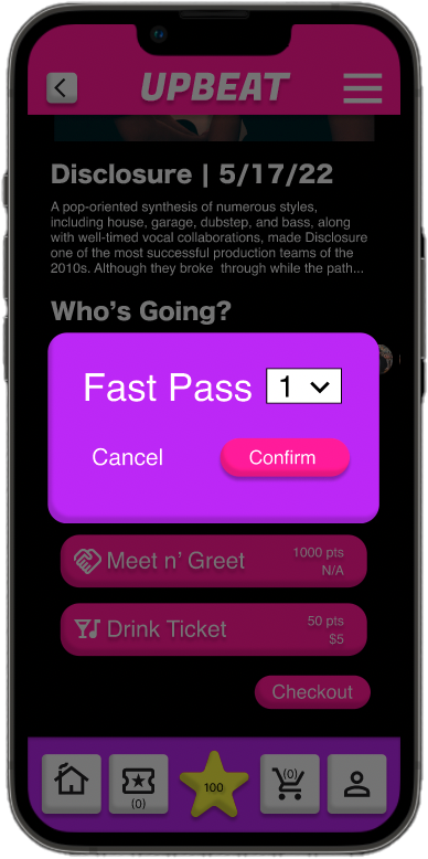
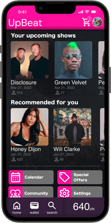
It was found that many of the interviewees hated waiting in line to get into their favorite venue. Having a loyalty app that allowed them expedited entry via a “Fast Pass” is something they took significant interest in. Providing app users with special privileges was the foundation of UpBeat. UpBeat would also recommend upcoming shows to its users, helping them to be aware of shows they may want to attend.
*NOTE: The accumulation of points is assumed to be done through venue attendance and related purchases, but requires further exploration. The focus of this project was on points usage and basic app features.
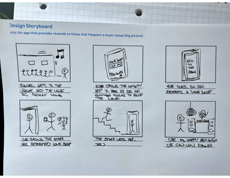
Storyboards and sketching leveraged to develop the user flow and the layout's experience
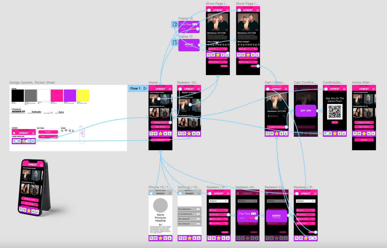
To map out the experience and begin envisioning the app’s layout, storyboards and rough sketching were helpful. The storyboard identified key steps in the user flow. Sketching helped to understand the layout necessary for an intuitive and easy-to-use experience.
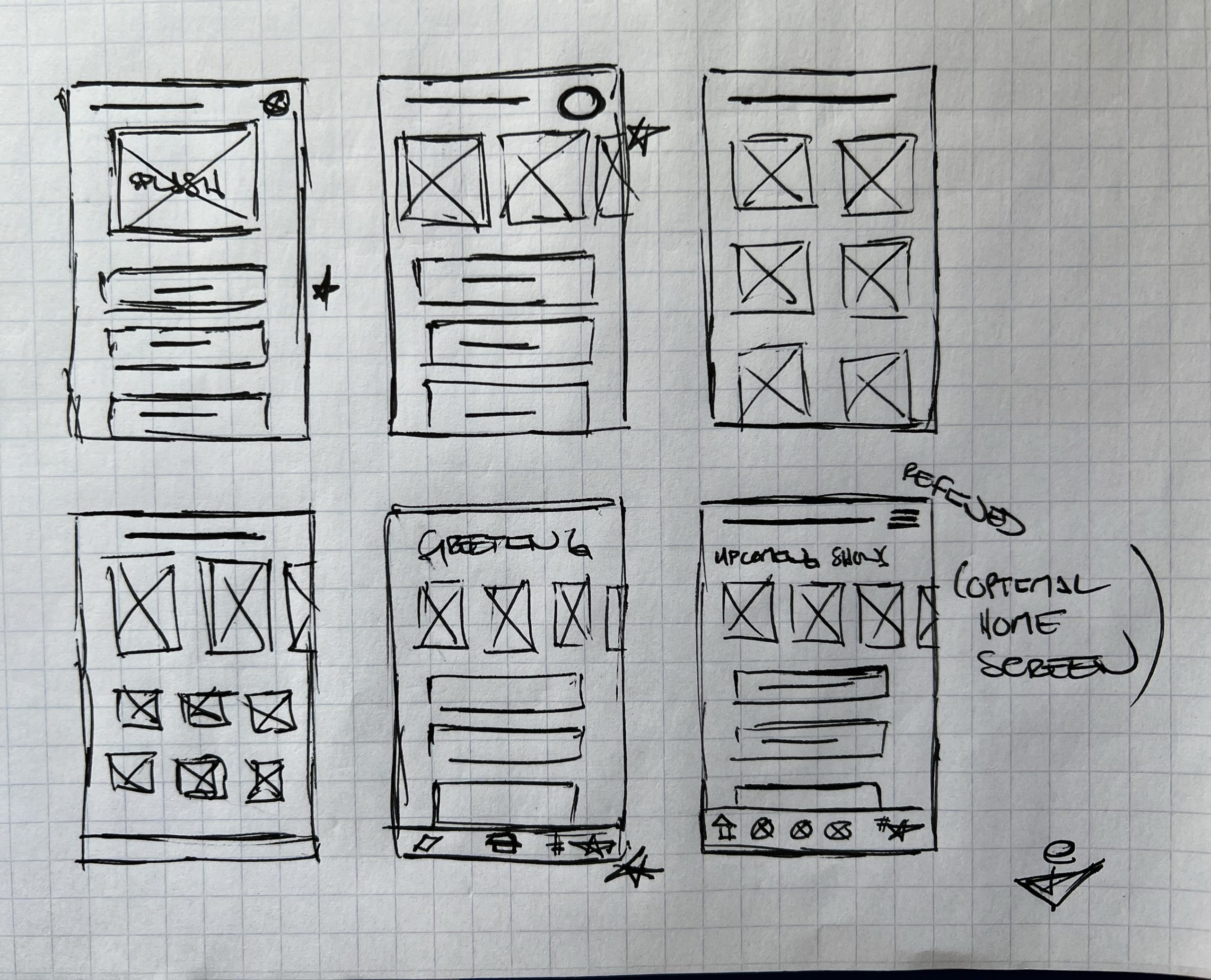
Low-fidelity wireframes allowed for initial usability testing and better understanding of the app's layout
Using Figma to create low-fidelity wireframes and prototype the experience served as a quick way to understand user behavior and bring the app to life. Using the Figma mobile app to run the prototype brought additional realism to initial testing.
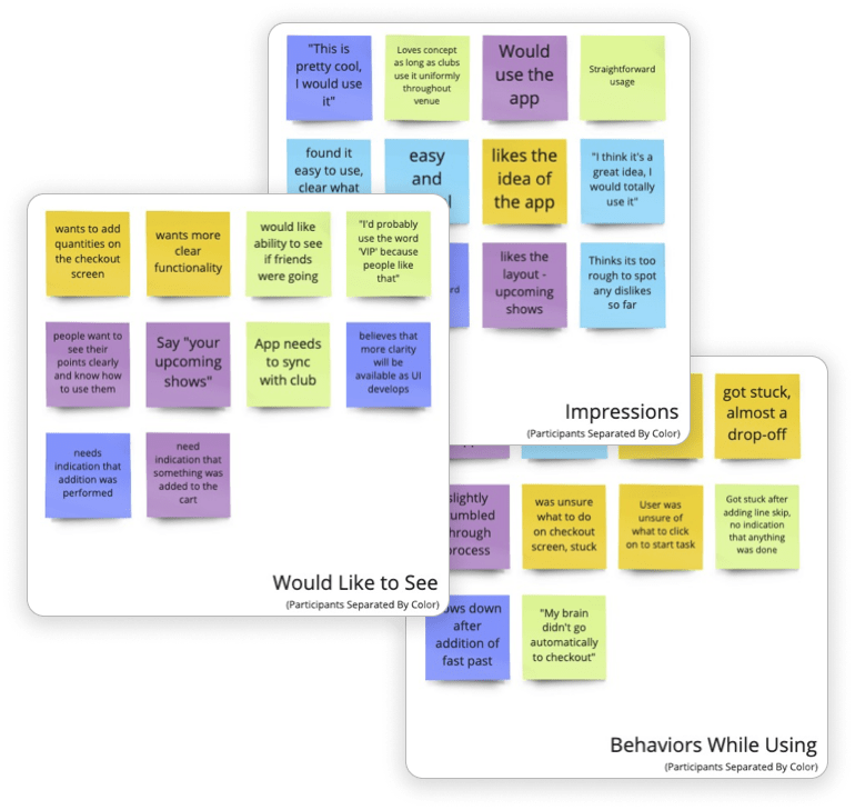
Initial usability testing proved the solution to be desirable, but user flow confusion required fixing
Testing an early concept with the target audience proved the idea of UpBeat to be well-received, but not without issues:
Users found the product to be desirable, overall
Confusion was experienced when performing the ‘redeem’ task
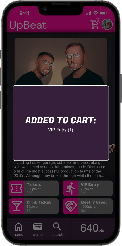
It was unclear that something was ‘added to the cart’
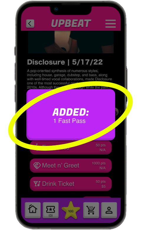
Addressing user friction points improved intuitiveness and ease of use, inspiring confidence to increase fidelity
To address feedback from initial usability testing, a few changes to the app were made:
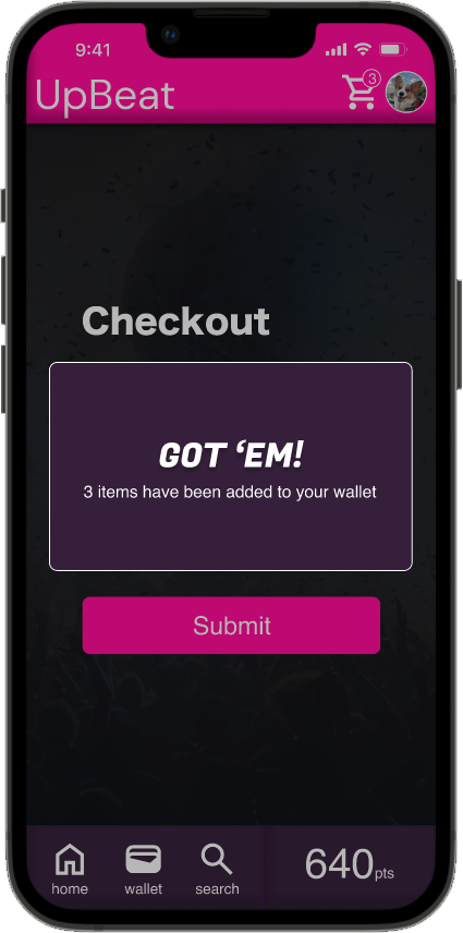
An “Added to Cart” confirmation screen was created to better indicate an item’s addition
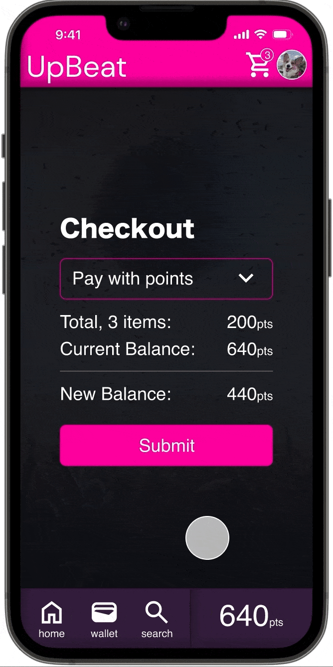
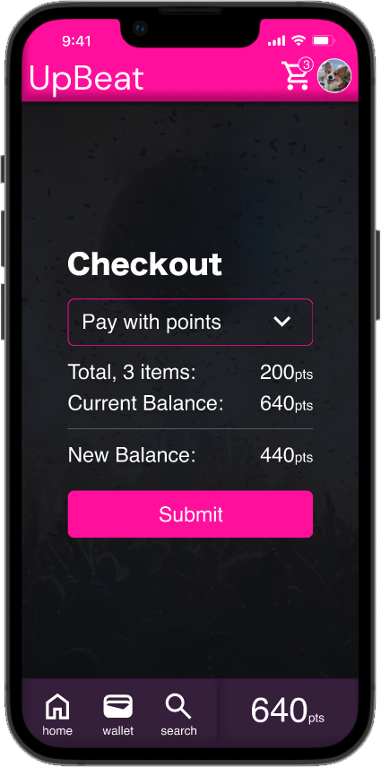
The checkout screen was simplified to increase clarity:
Added a large CTA with clear action verbiage
Removed unnecessary details to reduce cognitive load
Adjusted typography to improve app navigation
Addressing user friction points improved intuitive and ease of use, inspiring confidence to increase fidelity
To address feedback from initial usability testing, a few changes to the app were made:
An “Added to Cart” confirmation screen was created to better indicate an item’s addition
The checkout screen was simplified to increase clarity:
Added a large CTA with clear action verbiage
Removed unnecessary details to reduce cognitive load
Adjusted typography to improve app navigation
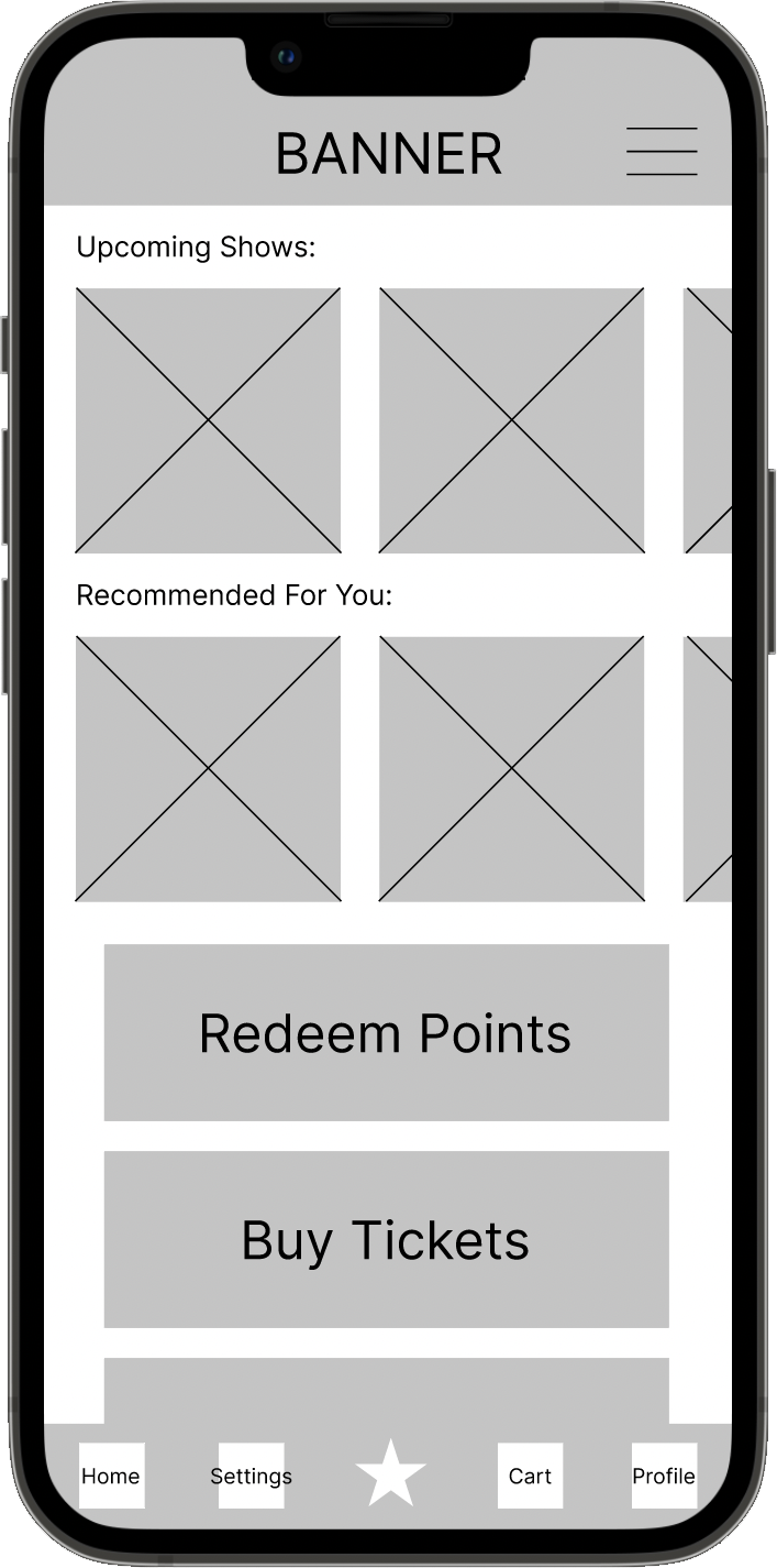
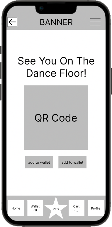
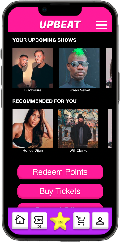
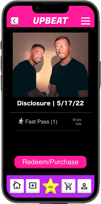
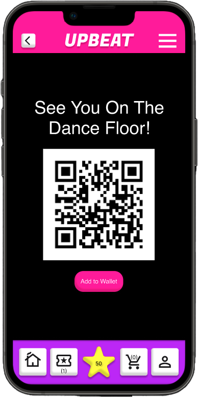
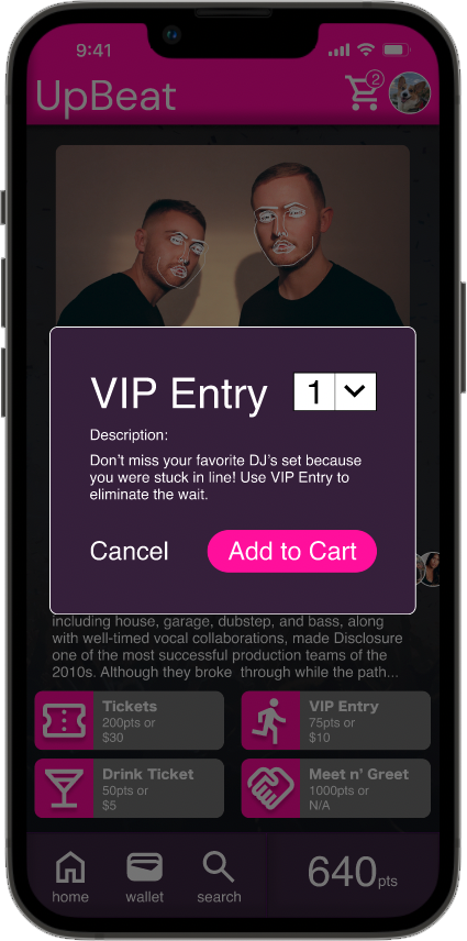
Loyalty Rewarded
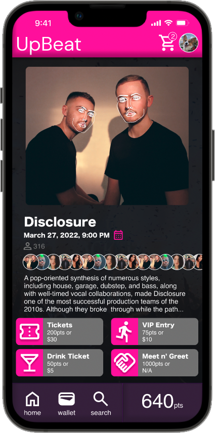
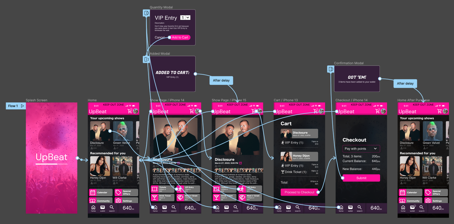
With key points of feedback addressed, the design could progress to high-fidelity mockups and the ‘final’ flow could be prototyped. The end result was an intuitive user journey that provided loyal music venue patrons with meaningful rewards:
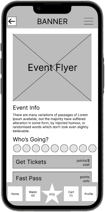
The user opens the app and taps on one of their upcoming shows
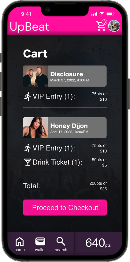
The user adds rewards to their cart
Points are redeemed
A QR code for each reward is added to the user’s in-app wallet
Those that tested the app liked the concept, function, and design. They believed that it served a useful purpose and that it was well-designed. Usage and delight with the app would in-turn increase venue growth and loyalty:
“I would totally use this, it would have been handy last weekend.”
What I Learned
• The importance of users knowing that their actions led to a result; make it clear that something was ‘added to the cart.’ • Be aware of implicit bias during all phases of the process. • Bake in accessibility.
I’ve learned a lot since UpBeat’s completion in May of 2022. With the knowledge and wisdom I gained, I wanted to see how I could improve upon the original design. Continue reading to find out how this turned out.
Areas of Improvement
Visual design: more balance and sophistication while maintaining vibrance
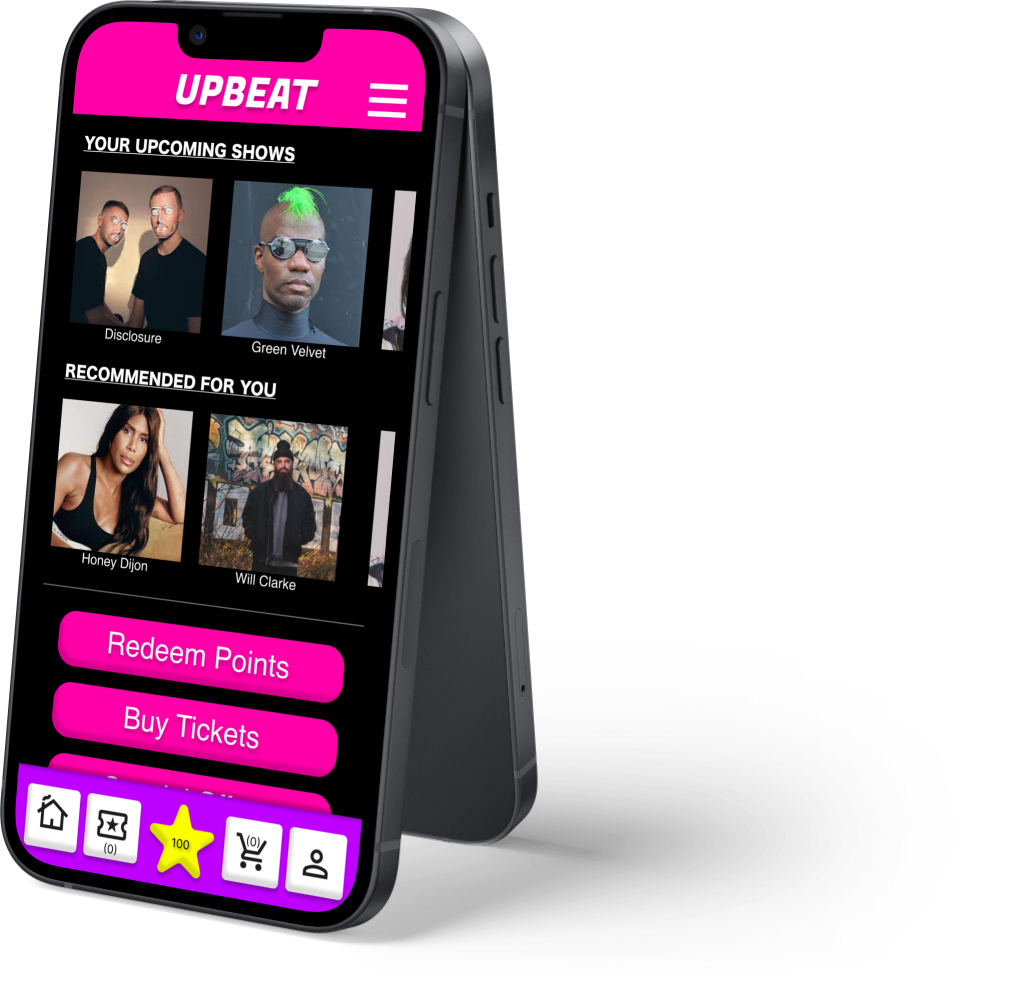
Through a variety of projects, various sources of inspiration, and more familiarization with common design tools, my visual design skills have significantly progressed. Using what I now know, I gave UpBeat a more polished look. Color is more balanced, buttons are refined, and the app’s various components are more cohesive. Items like a splash screen and iPhone status bar were also added to provide more realism.
More concise, clear copy that evokes more value
With improvements to visual design came improvements to general communication. UpBeat now provides the user with more useful information without adding clutter. The user is less likely to get lost or confused, and it takes fewer taps to answer questions they might have (when is the event? how many people are going? do I have enough points? etc.). Some of the verbiage was also updated to improve the perception of value, for example: “Fast Pass” was replaced with “VIP Entry.”
Simplicity added by removing redundancies
Thinking further about how UpBeat would be used and how similar apps are frequently used, it became clear that there were unnecessary redundancies within the app. For example, a ‘Get Tickets’ button and screen didn’t make sense because this could be done from the screen for a given event, and tickets aren’t the only redeemable reward. Additionally, using Figma’s overlay prototyping feature allowed for an overall reduction in screens for the main user flow.
UpBeat: Revised Mockups
The Revised Prototype
A fresh prototype with a more simplified user flow